From juvenile to fresh and premium
Branding / Strategy / Art Direction / Graphic Design / Food Photography / Print / Web Design / Typography
In this recent project of ours, I had the exciting opportunity to transform Edible’s brand's identity and enhance its market presence. Combining creativity with strategic vision, we meticulously analyzed the brand's core values, target audience, and competitive landscape to develop a comprehensive rebranding strategy.
From refreshing the logo to updating the color palette and typography, every element was carefully curated to evoke the desired emotional response and align with the brand's new positioning. Collaborating with a talented design team, we brought the vision to life, creating a cohesive and modern visual identity that resonates with the target demographic.
The result is a revitalized brand that not only reflects its evolution but also captivates the audience, fostering a renewed sense of connection and relevance in the market. The rebranding project stands as a testament to the power of strategic design in elevating a brand's identity and fostering long-term success.
We focused on enhancing the visual impact and clarity of a brand's identity. Through meticulous line refinement, I aimed to strike the perfect balance between simplicity and sophistication. Every stroke was carefully reconsidered to ensure a clean, modern aesthetic while preserving the essence of the original design.
The process involved fine-tuning details, adjusting proportions, and eliminating any unnecessary elements to create a more streamlined and versatile logo. The refined lines not only contribute to a more polished appearance but also enhance the logo's scalability and adaptability across various mediums.
This attention to detail in line refinement was not just about aesthetics; it was a strategic effort to ensure the logo effectively communicates the brand's values and resonates with its target audience. The refined logo now stands as a visual representation of the brand's evolution, maintaining a timeless quality while embracing a contemporary edge.
The new logo serves as a thoughtful evolution from its predecessor. Retaining the beloved playful roundness that characterized the brand's identity, we introduced a subtle yet impactful transformation by incorporating refined edges. This imparts a sense of modernity, almost like a coming-of-age moment for the brand. The interplay between the familiar curves and the newfound edges elevates the overall aesthetic and gives the brand a more sophisticated, grown-up allure. The decision to preserve the essence of the past while embracing contemporary design elements aimed to strike a delicate balance between nostalgia and a forward-looking vision.
Fine line, kerning and vector work
Undertaking a rebranding project presented a multifaceted challenge that required a delicate balance of creativity and strategy. Navigating through the intricate landscape of brand identity, the task involved deciphering the essence of the existing brand and envisioning its future trajectory. One of the primary challenges was to articulate a cohesive narrative that seamlessly threaded the brand's heritage with its aspirations. Striking the right chord between innovation and brand continuity demanded a thorough understanding of market trends, consumer expectations, and the competitive landscape.
Before and after storefront
The process also involved managing stakeholder expectations, as diverse perspectives converged on the brand's identity. It required effective communication and collaboration to ensure that every decision resonated with the brand's core values while fostering a positive reception among key stakeholders.
Adapting to the evolving needs of the target audience posed another hurdle. Balancing contemporary design elements with a timeless appeal required a nuanced approach to ensure the rebrand not only captured current market trends but also possessed enduring qualities.
OUR SEAL DESIGN
The inspiration for our new seal design drew from the symbolic power of approval seals found in passports. Delving into the world of international recognition and endorsement, we sought to encapsulate that sense of authority and trust within our brand.
Emulating the distinctive circular form of passport approval seals, our design team crafted a unique seal for our brand that signifies not only approval but also a commitment to excellence.
The intricate details within the seal echo the precision and attention to detail associated with official stamps. This design choice serves not only as a visual nod to the heritage of approval seals but also reinforces the brand's dedication to meticulous craftsmanship and unwavering quality.
OUR FRAME DESIGN
Our brand's distinctive frame isn't just a design element; it's a reflection of life's most cherished moments. Inspired by the way photographs capture and immortalize milestones, our frame is an ode to those significant instances that shape who we are.
Much like the borders that encase precious photos, our frame symbolizes the importance of defining moments in your journey. Its contours draw attention to the beauty within, emphasizing the idea that life, like a photograph, is made up of frames that encapsulate stories, achievements, and memories.
This carefully crafted design invites you to see our brand not just as a symbol but as a part of your narrative, a frame that resonates with the meaningful and impactful moments that enrich your story. It's more than a visual element; it's an acknowledgment of the frames that make your life uniquely yours.
Introducing our vibrant new branding under the summer sun! Our latest billboard is a burst of summer freshness, perfectly encapsulating the essence of our revitalized identity. The color palette, inspired by the season's brilliance, radiates energy and positivity, instantly catching the eye of passersby.
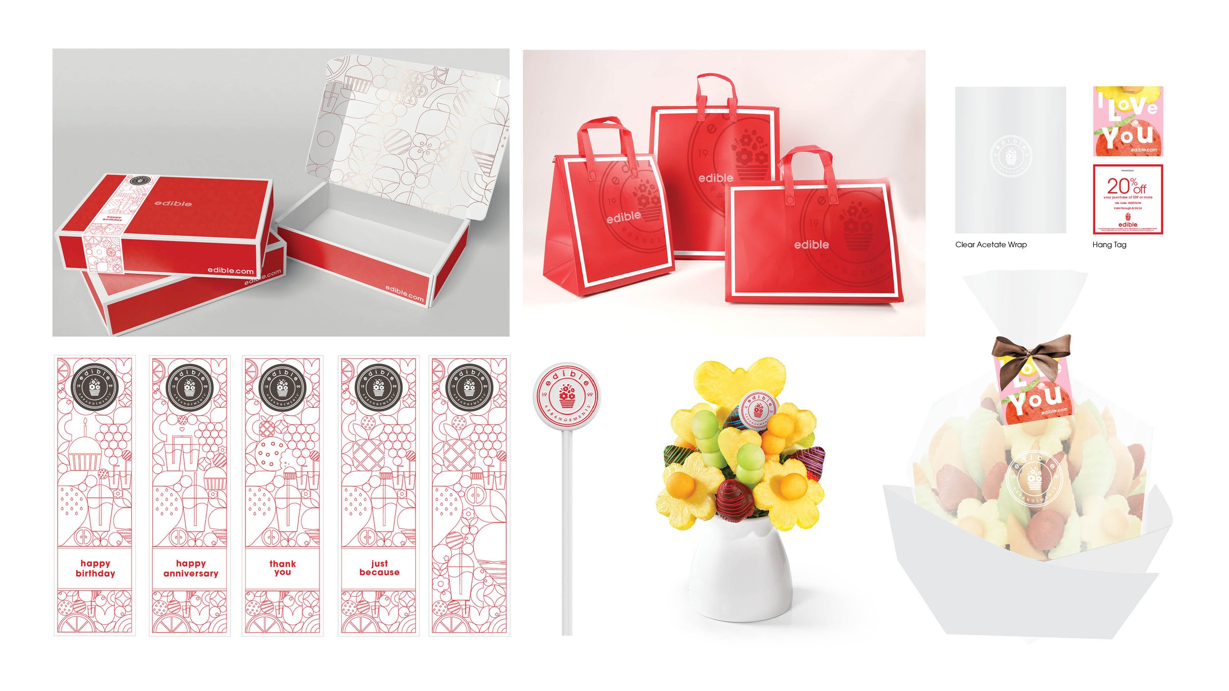
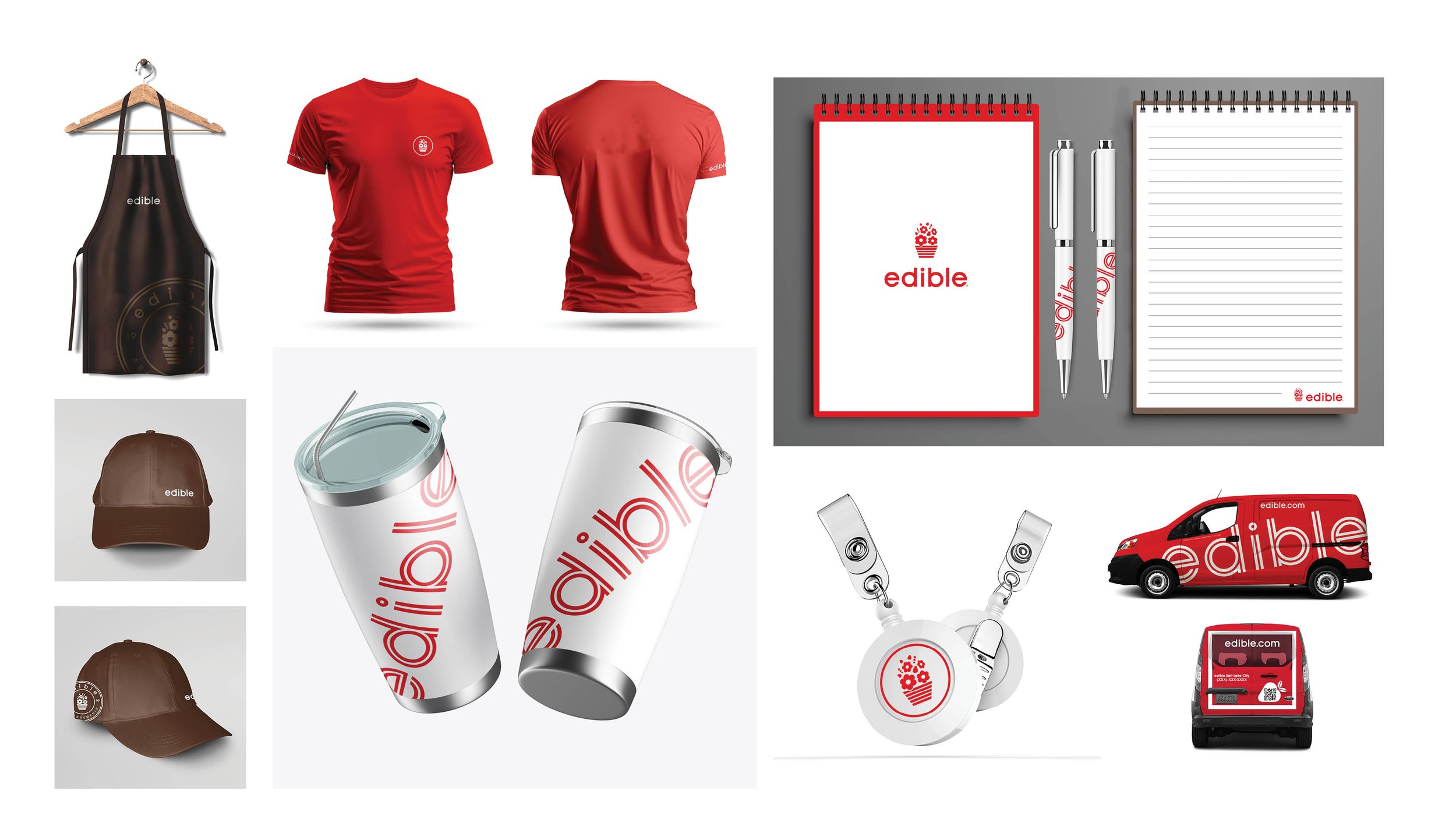
From sleek business cards to dynamic social media graphics, the versatility of our new branding shines through. The gallery unfolds like a narrative, illustrating how our logo, with its playful roundness and contemporary edges, harmonizes effortlessly with diverse applications. It's not just a visual transformation; it's a journey through the adaptability and sophistication of our brand in action.
As you scroll through the gallery, witness the logo's evolution on products, packaging, and digital platforms. The cohesive design language ties together every image, creating a visual tapestry that reflects the essence of our reinvigorated brand. Join us on this exploration of creativity and functionality, where each image tells a story of modernity, elegance, and the exciting possibilities our new branding brings to life.


